
The Techjoomla Blog
A Multilingual Website in 8 Languages - DIKSHA

We recently happened to design a widely adopted learning website for one of our clients. India, being a multicultural and multi-diverse country, languages and dialects all vary from state to state and so the teaching medium also changes. Designing a multilingual educational website was a challenge. An additional challenge was to deliver the same typographical/font representation across all channels like a book, a website, and a mobile app, as it matters in education domain.
We identified that the page elements can be divided into 2 categories - Interface elements and the content elements. Interface elements help you in website usage like navigation, search etc while the content elements are the main part which the user is looking for and it defines the page. Users were given a choice to choose the interface language. The content, however, was available in multiple languages. An analogy can be made with popular video delivery websites such as Netflix and Amazon Prime Videos where the user can choose interface language in preferences while the movie language is independent of the interface language.
Design Constraints
From a designer’s perspective, we had to work with 5 constraints - language directionality, translated text length variations, line-height, font-size and the font itself.
Text length / width
The text length varied according to the selected language. A translated interface element may be short or lengthy in another language.
Line-Height
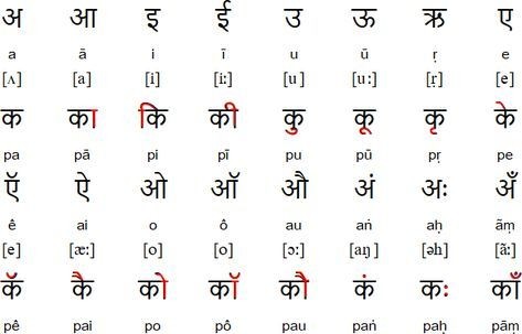
Different languages have different scripts. The Devanagari script is used for Hindi & Marathi, while English is Latin. In Latin, the alphabets are written on the same line whereas Devanagari involves various vowel diacritics that are written above and below the line hence requires more vertical space/line-height. Eg -
Font-Size
The same font size for different languages may not be a good approach as one language may look normal but in another language, it may be difficult to read. We had to work on displaying an adequate font-size for the various languages.
Font
We had to work on the font for each language to display uniform UI for across all operating systems, browsers and devices. Global giants like Google, Facebook & Twitter don’t use any web font, they rely on the operating system fonts which in result does not give consistent font experience.
Approach
So far the traditional way for a multilingual website is to maintain two different CSS files based on directionality, which is widely adopted by various popular CMS like Joomla. The reason for maintaining 2 different files was that most frameworks ( Bootstrap 2 & 3 ) were based on float properties.
Flex-based approach
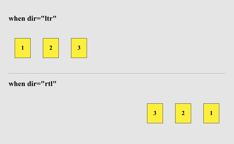
With the recent developments in browsers & their adoption by a large population, we can adopt an alternative approach to maintain only one CSS file with no or less code duplication. Flexbox is now a widely supported CSS property. There are various frameworks based on flexbox properties. Eg - Bootstrap 4, Semantic UI, etc. A great thing about flexbox is, it changes directionality based on the dir attribute. A normal flex starts from left while if a dir=”rtl” is added to the parent element then it changes its directionality. Demo can be seen at - https://ui-demo.github.io/demos/demo5/
The lang and dir attributes defined in HTML tag & Content tags not only plays an important role in SEO & Accessibility but are also useful as CSS selectors for designing a multilingual website.
Some CSS properties do not behave differently when dir attribute is changed. Eg -
- Float
- Text-align
- Unequal / Asymmetric left and right margin
- Unequal / Asymmetric left and right padding
- Unequal / Asymmetric Left and right for absolute or fixed elements.
We divided CSS for an element into 2 types of classes -
- Directional reusable classes - utility classes such as float-left, float-right, text-left, text-right, ml-0 ( margin-left: 0 ), pr-5 (padding-right: 5px;) and enclosed them in dir selectors.
- Non-directional BEM classes - all other non-directional properties go in this.
The Directional properties were nested inside dir attribute selectors
*[dir="ltr"] {
  .text-left {
    text-align: left;
  }
  .text-right {
    text-align: right;
  }
  .float-left {
    float: left;
  }
  .float-right {
    float: right;
  }
  .ml-auto {
    margin-left: auto;
  }
  .ml-0 {
    margin-left: 0;
  }
  .ml-4 {
    margin-left: 4px;
  }
  .ml-8 {
    margin-left: 8px;
  }
}
*[dir="rtl"] {
  .text-left {
    text-align: right;
  }
  .text-right {
    text-align: left;
  }
  .float-left {
    float: right;
  }
  .float-right {
    float: left;
  }
  .ml-auto {
    margin-right: auto;
  }
  .ml-0 {
    margin-right: 0;
  }
  .ml-4 {
    margin-right: 4px;
  }
  .ml-8 {
    margin-right: 8px;
  }
}
Language with the largest usage share can be made default language and for other languages the changes can be overridden wherever required. Eg -
.example {
 color: blue;
 font-weight: bold;
 font-size: 14px;
 line-height: 18px;
}
*[lang="hi"] {
  .example {
    font-size: 12px;
  }
}
*[lang="ur"] {
  .example {
    font-size: 13px;
    line-height: 17px;
  }
}
Example of splitting a class into directional and non-directional classes
<div class="example-wrapper" dir="ltr" lang="en">
 <div class="example"></div>
</div>

.example {
	margin-right: 8px;
	text-align: right;
	color: blue;
	font-size: 14px;
}

<div class="example-wrapper" dir="ltr" lang="en">
 <div class="example mr-8 text-right"></div>
</div>

.example {
	color: blue;
	font-size: 14px;
}
*[dir="ur"] {
	.example {
		font-size: 12px;
	}
}
*[dir="ltr"] {
  .text-right {
    text-align: right;
  }
  .mr-8 {
   margin-right: 8px;
  }
}
*[dir="ltr"] {
  .text-right {
    text-align: left;
  }
  .mr-8 {
   margin-left: 8px;
  }
}
Note above -
Text-right and mr-8 are reusable classes and can be used anywhere.
When you subscribe to the blog, we will send you an e-mail when there are new updates on the site so you wouldn't miss them.
About the author
Blog Topics